Cart
0
Colour is not merely a visual aesthetic but an integral element of design that influences mood, communicates values, and even affects decisions.
Whether you're an interior designer, a graphic artist, or someone embarking on a DIY project, understanding how to effectively use colour can enhance your creations significantly.
This guide aims to explore the essentials of designing with colour, offering both fundamental principles and practical tips to empower your design journey.
Understanding Colour Theory
The foundation of any design involving colour starts with colour theory, a body of practical guidance to colour mixing and the visual effects of specific colour combinations.
Here are the core components:
Colour Wheel: Developed by Sir Isaac Newton in 1666, the colour wheel is a circular diagram of colours arranged according to their chromatic relationship.
The primary colours (red, blue, and yellow) are spaced evenly around the wheel.
Between these are the secondary colours (green, orange, and violet), which are created by mixing the primaries. Tertiary colours are formed by mixing primary and secondary hues.
Hue, Saturation, and Brightness: 'Hue' refers to the colour itself, 'saturation' indicates the intensity or purity of the colour, and 'brightness' or 'value' refers to how light or dark the colour is.
Manipulating these aspects lets designers create a sense of harmony, contrast, or balance.
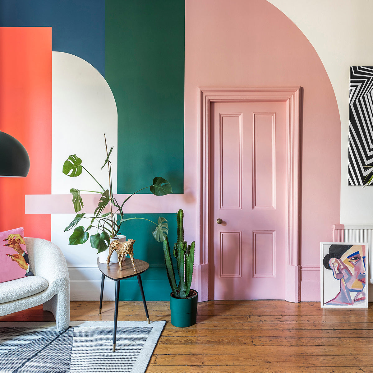
Colour Harmonies: These are specific combinations of colours that are aesthetically pleasing and balanced.
Common harmonies include analogous, complementary, and triadic schemes. Each has its own mood and visual impact, which can be harnessed to create different effects in design.
Psychological Impact of Colour
Colour psychology is another crucial aspect of design. Different colours evoke different feelings and can convey a variety of messages.
Here are some general associations:
Red: Energy, passion, danger
Blue: Calm, trust, professionalism
Green: Nature, growth, health
Yellow: Happiness, optimism, caution
Purple: Luxury, mystery, spirituality
When choosing colours for a design, consider the emotions you wish to evoke in your audience or the message you want to convey.
This decision-making should be informed by cultural contexts, as colour meanings can vary significantly around the world.

Colour Trends and Their Influence
Staying updated with colour trends can be crucial, especially in industries like fashion, interior design, and marketing. Trends often reflect broader cultural shifts or societal moods.
For example, Pantone’s Color of the Year is chosen based on a thorough analysis of global cultural currents and serves as a directional trend for branding, fashion, and design industries.
Practical Tips for Designing with Colour
Start with a Mood Board: Collect images, colour swatches, and materials that inspire you. This will help you visualise the colour palette and the overall mood of your project.
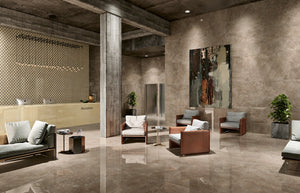
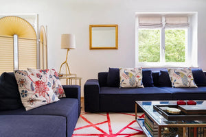
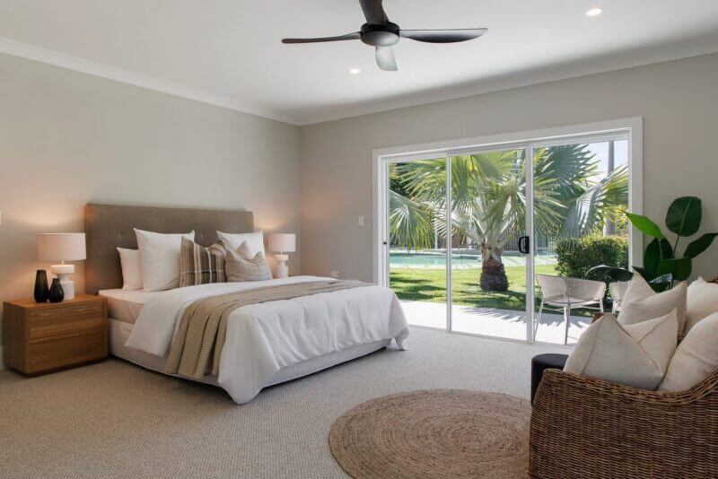
Use the 60-30-10 Rule: This is a classic decorating principle that helps create a balanced colour palette. It involves using 60% of a dominant colour, 30% of a secondary colour, and 10% of an accent colour in your design.
Consider the Lighting: Colours can look dramatically different under various light sources. Natural daylight shows the truest colour, incandescent lighting brings out warm tones and yellows, while fluorescent lighting casts a sharp blue tone.
Test Your Colours: Before finalising your colours, test them in the intended environment to see how they interact with each other and the light.
What looks good on a sample can look very different when applied on a larger scale or in different materials.
Use Contrast and Complementary Colours for Pop: To make an element stand out, use colours that are opposite on the colour wheel (complementary) or varying shades of the same colour for a subtler effect.

Conclusion
Designing with colour is a dynamic and powerful way to communicate visually.
By understanding the basics of colour theory, the psychological impact of colours, current trends, and practical application techniques, you can create designs that are not only beautiful but also effective in achieving your desired outcome.
Whether you're painting a room, designing a website, or creating a brand identity, the thoughtful use of colour can transform and elevate your project.
Over to You…
Do you agree with Designing with Colour: Guide? Or is there something missing, or you would like to add? We would love to hear from you in the comments – any feedback is greatly appreciated.
Ready to Shop the Exclusive Range of Matrix Furniture?
Shop all our furniture range here and if you have any questions don't hesitate to ask us!